
Recently, we’ve received a good bit of demand from our readers to write a post detailing basic HTML and CSS layouts. I figured I would go through and write up some CSS for a few of the more common layouts used in web design. Feel free to reuse, modify, and generally mess up the below code to help learn how to get your layout exactly how you need.
Lets start off our collection with a simple header-content-footer layout:
The Code
<!DOCTYPE html>
<html>
        <head>
                <title>CSS Layouts</title>
                <style type="text/css">
                        #header{
                                width:100%;
                                min-width:960px;
                                margin:auto;
                        }
                        #content{
                                width:960px;
                                margin:auto;
                        }
                        #footer{
                                width:100%;
                                min-width:960px;
                                margin:auto;
                        }
                </style>
        </head>
        <body>
                <div id="header">
                    <!-- HEADER CONTENT GOES HERE -->
                </div>
                <div id="content">
                    <!-- CONTENT GOES HERE -->
                </div>
                <div id="footer">
                    <!-- FOOTER CONTENT GOES HERE -->
                </div>
        </body>
</html>
The Result

Now that we’ve seen the basics behind aligning and centering divs, We can use these principals to create a dynamic layout with a header and a left side bar.
The Code
<!DOCTYPE html>
<html>
        <head>
                <title>CSS Layouts</title>
                <style type="text/css">
                        #header{
                                width:100%;
                        }
                        #left-side-bar{
                                width:20%;
                                float:left;
                        }
                        #content{
                                width:80%;
                                float:right;
                        }
                </style>
        </head>
        <body>
                <div id="header">
                    <!-- HEADER CONTENT GOES HERE -->
                </div>
                <div id="left-side-bar">
                    <!-- SIDEBAR CONTENT GOES HERE -->
                </div>
                <div id="content">
                    <!-- CONTENT GOES HERE -->
                </div>
        </body>
</html>
The Result

Of course, you could always modify the last example very easily by changing the width on the two panels to change the overall layout to a right sidebar. Simply switch the 80% and 20% widths. The result will give you something like this:
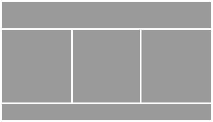
 Let’s get a little more creative and lend some of the CSS from one of our other blog posts: Beautiful, Dynamic 3 Column CSS Layout. In this post, we show a (rather simplistic) snippet of code that allows you to create three columns within any preexisting element on your page. We’ll use this example to create a page layout with a header, 3 columns, and a footer. First, I’ll demonstrate this layout with a fully responsive example.
The Code
<!DOCTYPE html>
<html>
        <head>
                <title>CSS Layouts</title>
                <style type="text/css">
                        #header{
                                width:100%;
                                margin:auto;
                        }
                        #left{
                                width:30%;
                                float:left;
                                margin:auto auto auto 2%;
                        }
                        #right{
                                float:right;
                                width:30%;
                                margin:auto 2% auto auto;
                        }
                        #middle{
                                position:relative;
                                left:0;
                                right:0;
                                margin:auto;
                        }
                        #footer{
                                width:100%;
                                margin:auto;
                        }
                </style>
        </head>
        <body>
                <div id="header">
                    <!-- HEADER CONTENT GOES HERE -->
                </div>
                <div id="left">
                    <!-- LEFT COLUMN CONTENT GOES HERE -->
                </div>
                <div id="right">
                    <!-- RIGHT COLUMN CONTENT GOES HERE -->
                </div>
                <div id="middle">
                    <!-- MIDDLE COLUMN CONTENT GOES HERE -->
                </div>
                <div id="footer">
                    <!-- FOOTER CONTENT GOES HERE -->
                </div>
        </body>
</html>
The Result
 We can also make this example use static columns instead of columns that adapt to fit the screen. In order to do that, we would wrap our columns in a container div with a set width like this.
The Code
<!DOCTYPE html>
<html>
        <head>
                <title>CSS Layouts</title>
                <style type="text/css">
                        #header{
                                width:100%;
                                min-width:960px;
                                margin:auto;
                        }
                        #container{
                               width:960px;
                               margin:auto;
                        }
                        #left{
                                width:30%;
                                float:left;
                                margin:auto auto auto 2%;
                        }
                        #right{
                                float:right;
                                width:30%;
                                margin:auto 2% auto auto;
                        }
                        #middle{
                                position:relative;
                                left:0;
                                right:0;
                                margin:auto;
                        }
                        #footer{
                                width:100%;
                                min-width:960px;
                                margin:auto;
                        }
                </style>
        </head>
        <body>
                <div id="header">
                    <!-- HEADER CONTENT GOES HERE -->
                </div>
                <div id="container">
                    <div id="left">
                        <!-- LEFT COLUMN CONTENT GOES HERE -->
                    </div>
                    <div id="right">
                        <!-- RIGHT COLUMN CONTENT GOES HERE -->
                    </div>
                    <div id="middle">
                        <!-- MIDDLE COLUMN CONTENT GOES HERE -->
                    </div>
                    <div id="footer">
                        <!-- FOOTER CONTENT GOES HERE -->
                    </div>
                </div>
        </body>
</html>
The Result

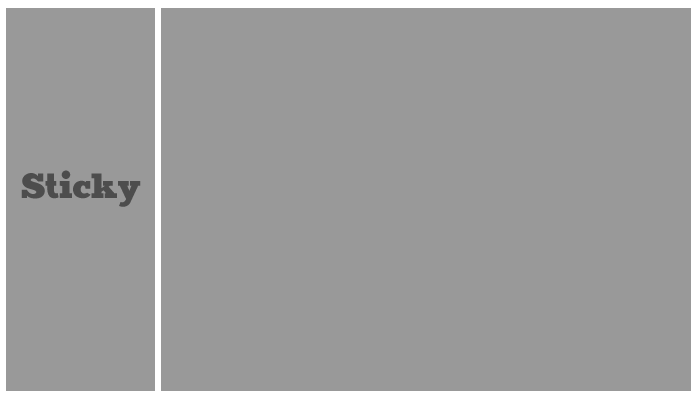
By using the position:fixed CSS property, we can also create layouts with “sticky panels” that stay with the user as they scroll through the page. For example, we could create a simple layout with a left column that stays on the screen.
The Code
<!DOCTYPE html>
<html>
        <head>
                <title>CSS Layouts</title>
                <style type="text/css">
                        #left-bar{
                                width:20%;
                                position:fixed;
                                left:0px;
                                top:0px;
                        }
                        #content{
                                width:80%;
                                float:right;
                        }
                </style>
        </head>
        <body>
                <div id="left-bar">
                    <!-- SIDEBAR CONTENT GOES HERE -->
                </div>
                <div id="content">
                    <!-- CONTENT GOES HERE -->
                </div>
        </body>
</html>
The Result
 Of course, this one can be reversed by floating the content div to the left and changing left:0px; to right:0px;
As you can see, the possibilities with CSS layouts are endless, and only require minimal knowledge of positioning and floats. You can modify the background colors, add paddings and margins, and anything else to spruce up these simplistic designs. Also, as always, we recommend that if you plan to copy and paste this code for use in your project, you should add a CSS reset to ensure that your layout is rendered correctly across all browsers.
Why doesn’t mine look like the pictures?
The photos I’ve provided are sample images to portray how your content will fit into the layout. If you simply copy and paste the code here, you won’t see anything but a white screen, because you haven’t populated the different areas with content yet. If you want your site to look more like our examples, try setting a background color and height on all of the various elements in the document.
Depending on the popularity of this post, I may make another with some more advance layouts. Let us know in the comments if you want to see more!
Comments On This Post
Nice tutorial