
As a graphic designer, Adobe Illustrator has become the most frequently used program on my laptop next to Google Chrome (because it’s perfectly normal to spend the majority of your day on the internet, right?). Despite this, I must admit that Ai and I didn’t always get along; we started out as mortal enemies, so much so that I didn’t even want it on my personal computer. “I’ll just use it on the school’s computers because I don’t need it!” I would whine. I hated it. I never thought I would need it. I thought I could figure another way to make my graphics… It wasn’t until I took my Typography class in college that I really opened up to the idea of using Illustrator. I finally realized the program’s true potential and began to understand it with the help and guidance of a (very) patient teacher. Illustrator slowly made it’s way into my life. I spent a good bit of downtime learning the ins and outs of the program and I’m still not even close to figuring it all out, but practice makes perfect, right? I quickly learned the importance of tutorials. There are so many out there and so many new ones being created that it’s hard to know what’s worth your time, but one needs to remember that the tutorial is all about what you take from it, not the final product.
Below are some examples of Illustrator tutorials I’ve completed or viewed in the past that teach you skills that can be used outside of just creating the tutorial’s final product.
(Click the images to view the tutorials)
Simple Radial Patterns
What this tutorial covers:
This tutorial explains a designer’s process for making a seemingly complex logo for a client. The logo is an intricate criss-cross of lines and colors that is easily created with Illustrator’s “Rotate” Tool.
What you should take from it:
The best thing you can take from this tutorial is how the Rotate Tool works. It’s a great basic application of the tool and an easy way for you to use it and comprehend its function. There are many possibilities with this tool in digital illustration. One can easily create radial patterns and textures. Radial patterns can look very sleek for logos and add an element of balance to many designs.

Simplistic, Yet Effective Logo Design
What this tutorial covers:
A designer’s process for developing and creating a logo for a client.
What you should take from it:
Designs don’t have to be incredibly in-depth. This logo has minimal graphic elements, but has enough that you get a feel for the company’s purpose. The font choice is sophisticated and “trendy” while the moon dotting the “i” plays off of the word “Nite”. Don’t try to make something brand new and never seen before for every client. Sometimes you just need to improve concepts that have been done before to really make an impact.

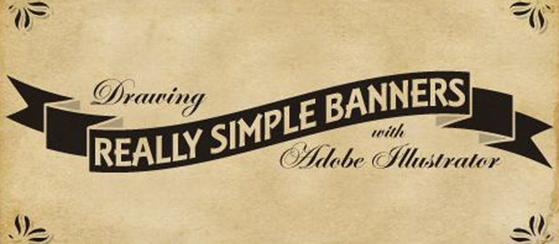
Stupid Simple Banner Creation
What this tutorial covers:
The incredibly basic steps needed to create graphic banners.
What you should take from it:
Banners are versatile. They can be integrated in many styles of design, and they’re usually a good way to indicate that the text inside of them is “IMPORTANT”. These are really good basic methods of banner creation that you can build on for your own personal use. Give these basic shapes some character with various colors, textures and shapes, and you can put emphasis on almost any design.
Learn All About Gradient Meshes
What this tutorial covers:
Making a burning match illustration from gradient meshes.
What you should take from it:
Seriously, you can never have too much practice with gradient meshes. They are your worst enemy and your best friend. They can either look incredibly beautiful or incredibly horrific. Your outcome depends on your skill level with this tool. Practice makes perfect!

Beautiful Vector Portrait Process
What this tutorial covers:
This tutorial takes you step by step through the process of creating a pretty realistic vector portrait. Although this is pretty complex, (like, 76 steps, complex) it’s incredibly detailed and helpful.
What you should take from it:
This is a pretty good reference for any vector portrait you do. It doesn’t have to be recreating this artist’s image, you can follow these general steps to create a vector of any portrait you’d like.
BONUS TIP: This tutorial tells you how to save Adobe Kuler schemes as Ai swatches! How cool!

Opacity Practice With Bubbles
What this tutorial covers:
Using gradients and opacity layers to create realistic vector bubbles.
What you should take from it:
When I completed this tutorial, I was so proud of my little soapy masterpiece. It’s really nothing special, but it taught me a lot as an Illustrator noobie. Watching how the layers build gave me a much better understanding of what each layer had to offer to the final piece.

Learn About Making Custom Brushes
What this tutorial covers:
Creating detailed illustrations with the help of custom brushes.
What you should take from it:
This walks you through making an illustration of a “glowing” jellyfish with the help of some Illustrator brushes. They show you how to make your own brushes too, which is always a useful skill to have. You never know when you’re going to need a repeating pattern along a path. (Seriously, it’s more common than you think.)

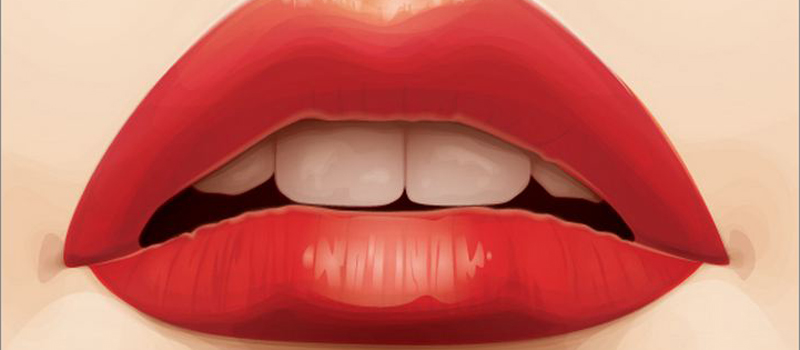
Vector Shading
What this tutorial covers:
How to create a detailed digital illustration of a pair of lips.
What you should take from it:
Digital illustrations may look complex, but they are nothing more than a combination of layers, gradients and blending modes. This tutorial goes into great detail of what tools the artist uses to achieve a lively, realistic work of art. They tell you what color swatches to use, what blending modes and everything else you need to create the finished product.
Depth and 3D Without the 3D Tool
What this tutorial covers:
Creating a vector illustration of a pair of glasses from basic shapes and opacity layers.
What you should take from it:
You don’t need any fancy tools to make something look 3D and you don’t need a perspective tool to make it’s angle believable. Seemingly complex computer illustrations are usually fairly simple, and going through this tutorial really helps to make you realize this. You will begin to look at digital art and say “Oh, I know how to do THAT!” and, let me tell you, that is a great feeling.

No Comments Yet.
Be the first to leave a comment on this article!