
There are many elements that make up a successful design, but the one that stands out as the most important is a good, solid color scheme. You can have a beautiful crisp design that looks great in its black & white wire frame form, but if your color scheme is weak it could ruin the entire design. Luckily, there are many tools out there to help you discover stunning color schemes that will be loved by other designers and viewers alike. My personal favorite, and probably the most popular among designers, is Adobe Kuler. Kuler lets you use your Adobe ID as an account in which you can create and save your own color schemes, or favorite and edit other users’ schemes. You can also use Kuler without an account to create and view schemes, but there is no save functionality.
In this post, I aim to lay out the basics of color scheming to help new (and maybe some seasoned) designers better understand it’s importance.
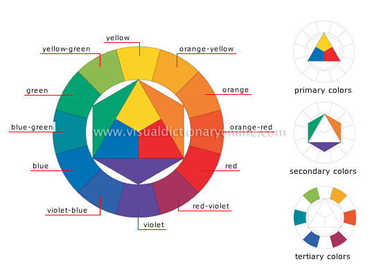
Some Basic Color Theory
Let’s just get one thing out in the open: I love color theory. Like, really love color theory. I like coming up with color schemes and pulling schemes from all kinds of stuff around me. I like making things fit into color stories when I’m designing, and I often create art based off of color sets… Obviously, you don’t need to be really into colors like I am to create a good, solid design. You just have to figure our a few basics and it will usually grow from there.
First and foremost, channel your grade-school art class experience. Remember your primary and secondary colors? Do you know what the complimentary colors are? How about monochromatic and analogous color schemes? Good, you’re going to need those. Why do you need to know something that basic, you ask? Well, because that’s really all there is to it. Once you know the basics of the color wheel and how the colors interact, you’ve pretty much got it. From there you can figure out what works and actually begin to understand why they work. This will also help you pick out nicer schemes from sources like Kuler because you will have a better eye for what works.
Don’t Judge A Scheme by It’s Swatch
All too often I will find myself on Kuler favoriting a bunch of fantastic color schemes only to find later that they weren’t what I thought. They may look amazing in that little strip of square swatches, but once they are applied to a design things get messy. You may find out that 2 of the colors in your scheme don’t look good next to each other, and there isn’t a good middle color to switch either one with. You may also find out that the colors look great as a swatch, but are harsh on the eyes once applied to a large project, such as a website. This is where “eyeing things up” comes into play. Once you pick out a color scheme, it’s usually pretty easy to just tweak the shades a bit to make them work. For example, if you have an issue with intense colors in your design, just go through and desaturate them a bit. Use the schemes you like as good bases to build off of and create something unique that works with your individual project.
Colors Have Feelings Too!
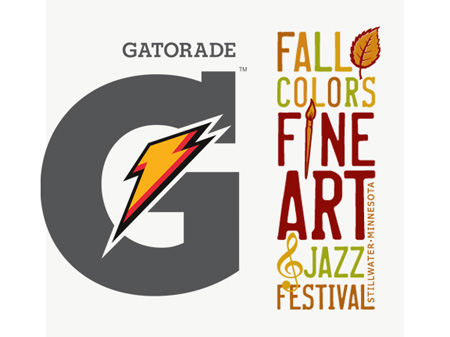
The most important thing to remember about colors is that people read emotions and feelings from them. When you combine certain colors, they portray a message and evoke different feelings in viewers. For example, orange is a very energetic color by itself. It’s often used for high energy designs – such as the lightning bolt on Gatorade’s logo. However, if you have a color scheme of orange, red and green, you get a calmer, more natural feeling from them.
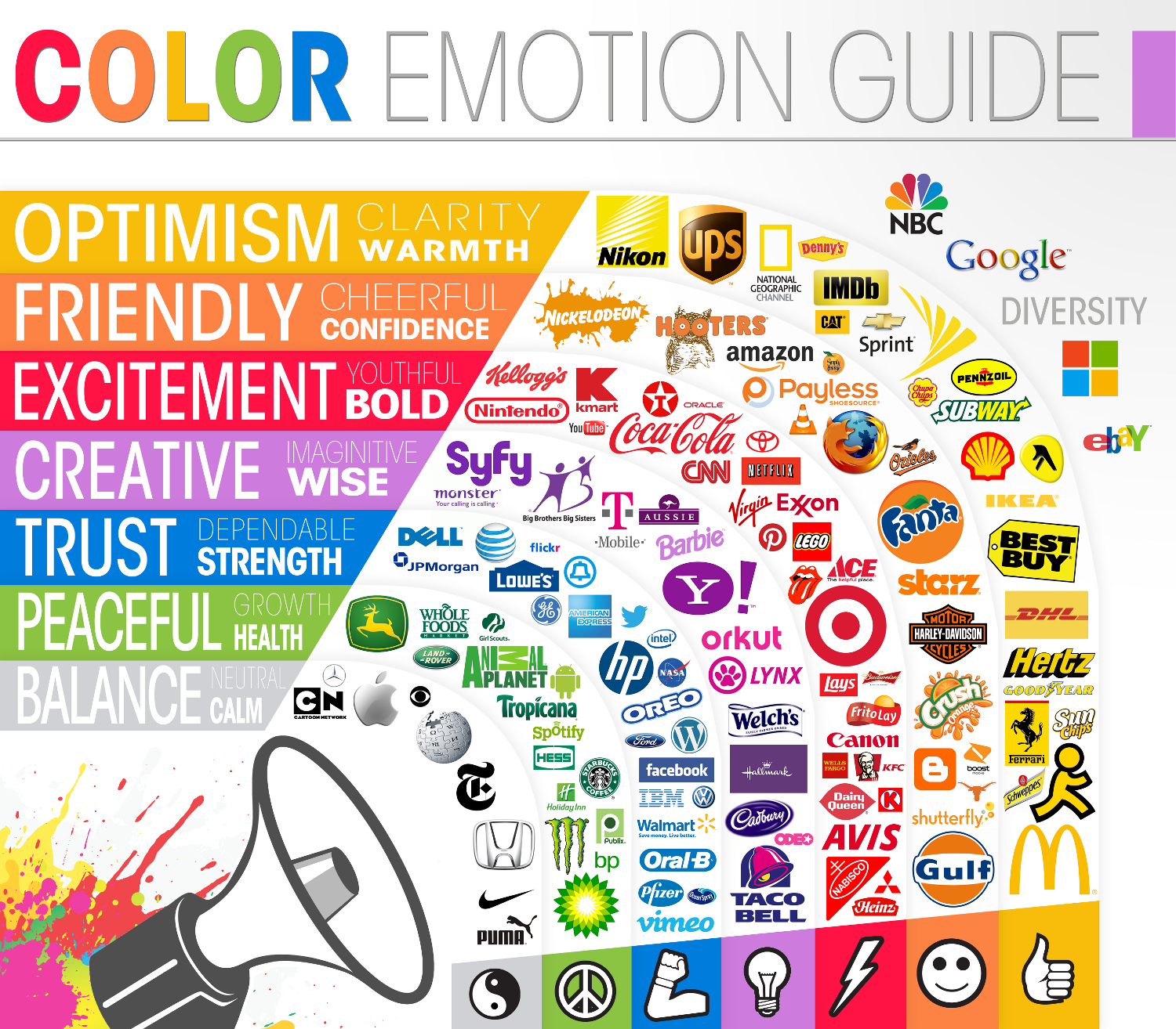
It’s pretty easy to figure out which colors mean which emotion. Just look around you and see for yourself. When you look at inflatable toys for a swimming pool, you see vibrant, neon colors that make them look fun. A corporate office for a company will use neutral colors like browns, greys and silver. This gives them a polished, professional feel that screams “I’m serious about my company”. Check out the graphic below for some real-life examples of how color emotion is used in design.
What’s Your Favorite Color?
When you’re designing for a client, they will often have a pretty good idea of what they want their project to look like. However, you are the designer in this situation, so you should know what’s best for the client (and should be looking out for them!). A client may pick out a set of colors for their logo and tell you that those are their favorite colors and they want to use them because they like them. This is not always a good idea. As the designer, it’s your job to let the client know if something is going to hurt the design or make it less effective. Say your client is a bakery owner. They’ve picked out the colors purple and yellow for their logo because they like them. These 2 colors aren’t going to lend to the idea of “tasty” or “appetizing” in any way. You might suggest to them that you use purple as a “punch” color, and create a palette of neutral shades like off-whites and tans to compliment it. These neutral shades are still in the yellow “range”, but aren’t as harsh against the punchy purple. The key is to work with the client’s wants while making their project meet their needs. You have to realize what is best for the outcome and express that to your client in a professional, reasonable manner.
Colors Of The Wind
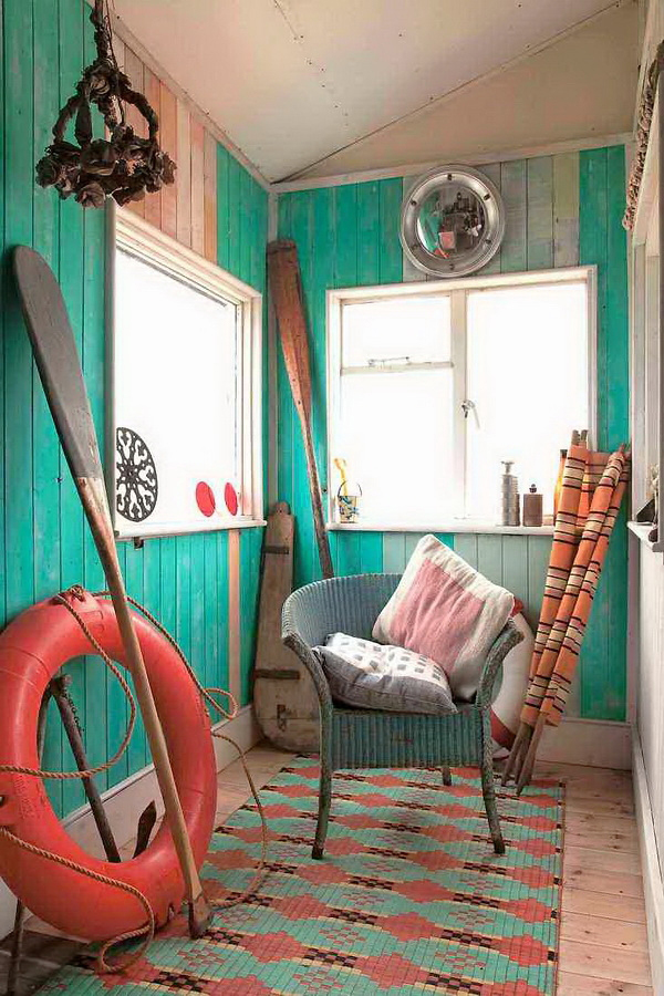
Many common color combinations can be traced back to nature. You might hear the term “fall colors” and instantly think of orange, red, yellow and brown. These are basic observations made by every person that can be used in design to portray any style you want. An interior designer would use colors found at the shore to create a “beachy” style interior (tan, blue, white and coral). A graphic designer making a pamphlet for recycling would use greens, blues and browns to portray the colors of the planet Earth.

With this basic concept in mind that color schemes can be derived from nature, one can start to pull color schemes from man made items. For example, the American flag has a color scheme of red, white and blue. This is also where color schemes like “retro” and “grunge” come from. These color schemes are taken from colors commonly used in a style to define it. I often find myself looking at color schemes in objects at the super market or shopping mall. Clothing is a great place to pick up quirky, unique color sets. Trending colors for clothing are ever changing, so there’s always new and interesting combinations to be seen on store mannequins. 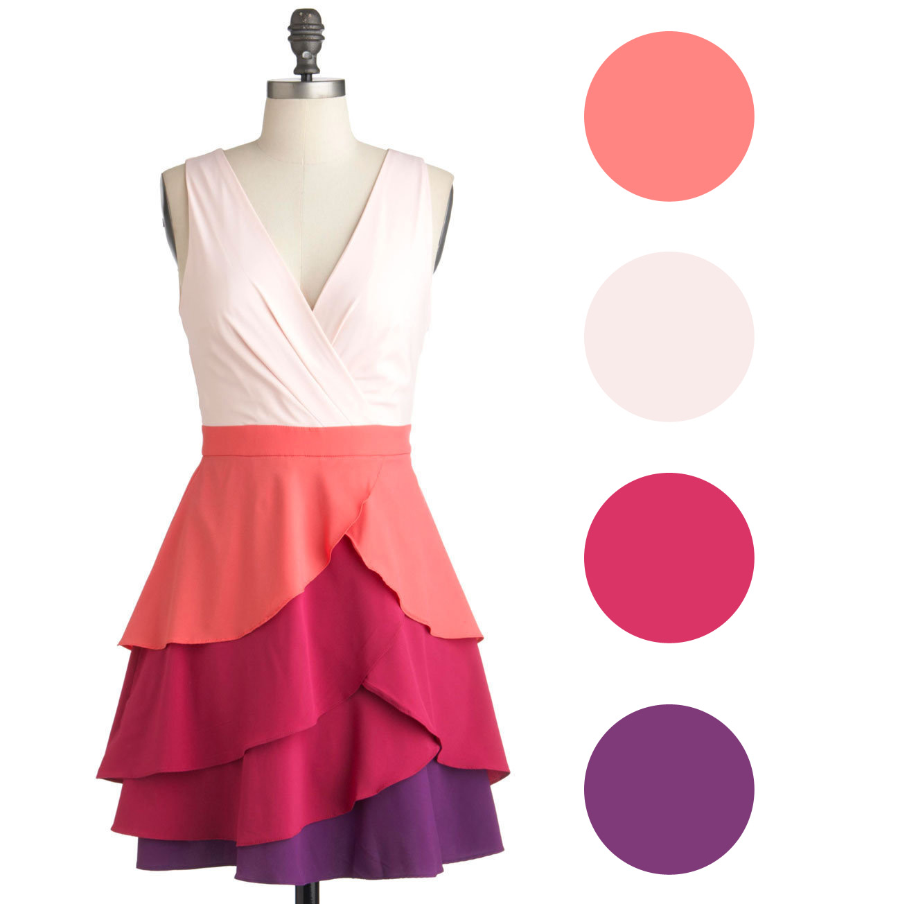
Summary
Color can be fun, but it can also be your worst enemy. While color makes all the difference in a design, it can easily become overpowering and distracting. The main thing to remember is that color is very basic. Don’t try to get too extreme with colors or they can pull the viewer’s attention in the wrong direction. Always keep color emotion in mind and make sure it relates to the main purpose of the design. With some practical use and experimentation, choosing color schemes can easily become a fun step in the design process. Just keep your eyes (and tastes) open for new combinations and try to pay attention to what’s trending and effective.
*Image Credit: All images were found via Google Image Search. If you see your image in here and would like it credited (or removed), please feel free to let me know personally at rachel@thoughtspacedesigns.com
No Comments Yet.
Be the first to leave a comment on this article!